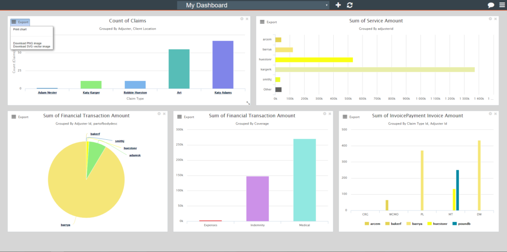
It’s hard to make decisions without all the facts. Right now you can run reports to gain new insights into your business, but wouldn’t it be more convenient to see your most up-to-date information at a glance. Now you can also use the ClaimPilot Analytics Dashboard to see your most relevant data displayed as charts to know you’re making the right decisions.
In addition to our powerful reporting tools, the dashboard will enable you to easily find answers to questions such as:
- Who are the top performing adjusters?
- How many claims are processed each month?
- Which day of the week do we received the most claims?
The Analytics Dashboard allows you to make decisions at a glance, or help you provide the decision-makers with easy-to-read charts that convey the latest results and trends.
Let’s take a look at the features
- Switch between multiple dashboards for organized views
- Create charts with data from Claim, Service, Invoice, Invoice Payment, and Financial sources
- Great fill tools to help you create your charts faster
- Top Feature
- Shows only top (or bottom) values instead of displaying them all. Trust us, it will come in handy!
- Choose the number of results you want to get back. Anything between 0-100 is fair game.
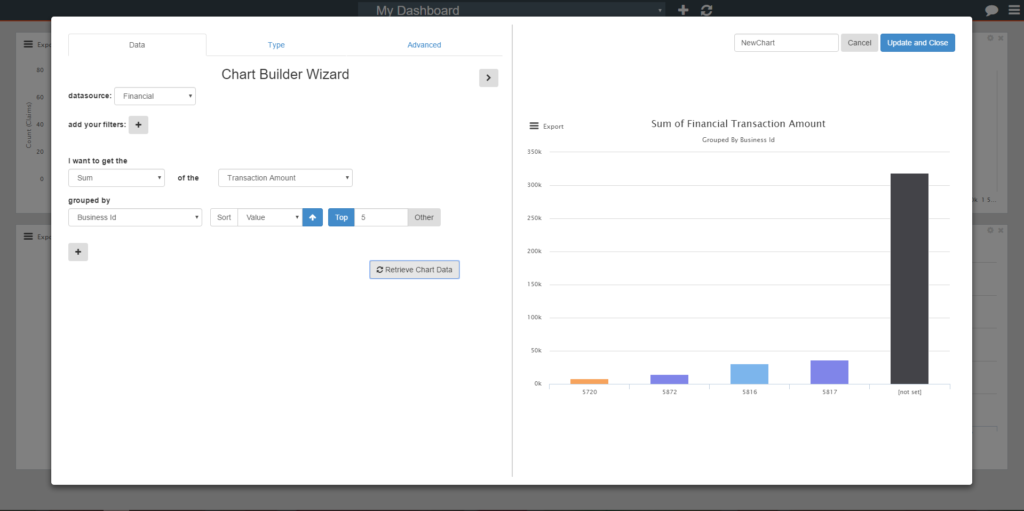
- Sort Feature – sort your values from smallest to largest, alphabetically, or by date.
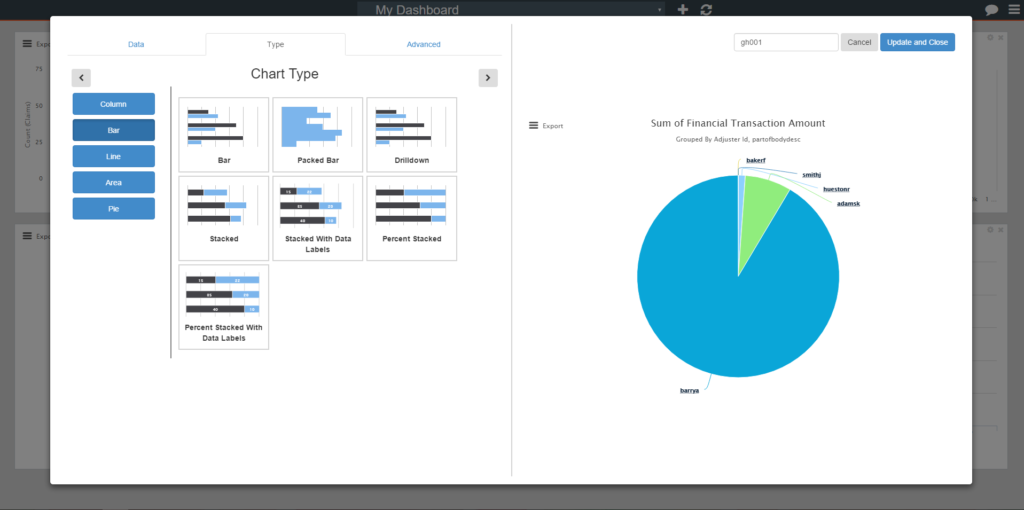
- Choose between more than 25 different types of charts
- Create combination charts (such as a multi-series line and column chart)
- Drill down into the chart for more detailed information
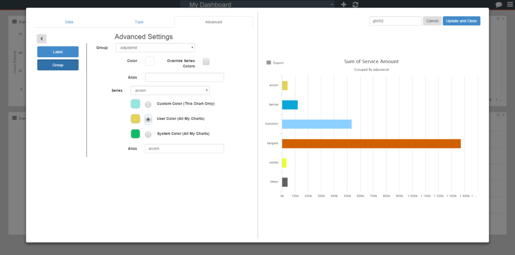
- Chart Colors
- Custom colors can be set by any user on any field. Do you love yellow and want to make all your charts varying colors of yellow? Custom colors will allow you to do that, one by one.
- User Color preference will set the colors to match across that user’s dashboard, so now you can automatically set all of your charts to varying shades of yellow! E.g. all GL values could be bright yellow across your dashboard, while WC values can all be set to be mustard yellow.
- And if your entire company loves yellow, System Color preference will match the colors within an entire company. For those not partial to a specific color, this feature enables all the GL values across everyone’s dashboard across the company to be the same color. WC columns or lines would all be another color.
- The user-color and system-color features not only makes the data easier to read on one specific dashboard, but across all dashboards within a company.
- Flexibility
- If you don’t care for the Chart Title or x-axis titles we have generate for you, it can be easily changed in the “Advanced” tab
- You can do that with the Y-Axis, X-Axis, and even your data labels
- Saved charts
- All charts are saved until explicitly removed by the user
- You can name your charts, remove them from the dashboard, and add them back easily
- Share charts and dashboard easily
- Create charts or entire dashboards for your team to get them started
- Easily let your coworkers see the data you’re seeing without having to give them each individual chart parameter
- Print or export your charts to images directly from the dashboard. That’s self-explanatory!